
1 min read
7 min read

Can you make your way through a maze without a map—or with an extremely rudimentary one? Maybe. But if you have a map that is clear and detailed, getting to the end of the maze is going to be a quicker and more enjoyable experience.
Trying to navigate your finances without a good Chart of Accounts (COA) is similar to this situation.
So many of our clients at Graphite (we are a startup accounting firm) come to us with a COA that is cluttered, disorganized, and either too simple, or too complex to interpret. It turns into something that they just go through the motions updating, rather than using as a tool to help them evaluate, plan, and stay organized. A good Excel template can help serve as the COA map that your startup needs to unlock its full potential and take control of your business finances.
What Is a Chart of Accounts?
A Chart of Accounts (COA) is a record of all of the financial accounts associated with your startup. This list, typically housed in an accounting tool (like QBO) or spreadsheet, helps you track any money coming in and out.
The purpose of a Chart of Accounts is to help your team separate and analyze the way that your organization is bringing in and spending money. An accurate and well-planned COA provides a clear understanding of your startup's overall financial health and helps make strategic decisions to drive further growth. It also serves as the foundation for creating key financial reports, such as the income statement and balance sheet.
Additionally, this record supports your reporting processes that keep you compliant with tax standards and investor expectations.
The Five Charts of Accounts
Typically, accounts are split into five separate categories:
- Assets - Resources owned by the company. Examples include cash, accounts receivable, inventory, equipment, property, etc.
- Liabilities - Debts or obligations. Examples include accounts payable, loans, accrued expenses and taxes payable.
- Equity - Ownership interest of shareholders, including common stocks and retained earnings. Another example is preferred stock.
- Revenue - Incoming payments for a company's products or services. Examples include sales revenue, service revenue and interest income.
- Expenses - Costs incurred in generating revenue. Examples include the cost of goods sold, rent expenses, salaries, utilities, advertising and other overhead costs.
QuickBooks Chart of Accounts Template vs. Custom Solutions
Many organizations default to the basic Chart of Accounts format we call the "QuickBooks Default." Essentially, this is just a list of expenses outlined in alphabetical order.
While this may be suitable for smaller teams with straightforward financial considerations, many startups quickly outgrow it. When a startup's financial situation becomes more complicated — including hiring, investing in technology to help it grow and attracting VC funding — a need arises for a better solution. Most high-growth startups need their Chart of Accounts to support more in-depth financial analysis, with clearly categorized expense accounts to track spending accurately.
The "QuickBooks Default" also doesn't consider any industry-specific considerations that may impact the success factors of your COA.
How to Import Your Chart of Accounts into QuickBooks
It's easy to import your COA into QuickBooks. Here's a step-by-step overview of the process:
- Log in to QuickBooks and click on the gear menu in the upper right-hand portion of your screen.
- Select "Import Data."
- Upload your existing Chart of Accounts Excel or CSV file from your device.
- Map the fields by aligning your spreadsheet columns with the appropriate QuickBooks field. QuickBooks will likely automatically map some fields, but you can easily adjust them as you see fit.
- Review the data to ensure accuracy and click "Import" to finalize the process.
QuickBooks Desktop vs. Online COA Setup
QuickBooks offers both desktop and online versions, which offer distinct COA setups.
One of the most significant benefits of using QuickBooks Desktop COA setup is its flexibility. It offers more customization and control over various account types and sub-accounts. Other benefits include industry-specific features and tools and offline functionality. It's also ideal for startups that require more advanced reporting and tracking.
Online QuickBooks setup is more streamlined and user-friendly, making it ideal for startups with a limited number of accounts or those just getting started with their accounting software. Online COA setup also allows for unlimited accounts and automates bank account and credit card transactions for easier reconciliation. The cloud-based nature of online QuickBooks also means users can access their COA from anywhere they have an internet connection, enhancing accessibility.

Chart of Accounts Templates by Industry
Manufacturing Chart of Accounts Template Excel
COAs for manufacturing startups tend to include separate accounts for raw materials, work-in-progress, finished goods, direct labor and overhead costs.
Service Business Chart of Accounts Template
COA templates for service businesses typically include labor tracking and project-based tracking.
Retail & eComm Chart of Accounts
For retail and eComm startups, consider accounts for inventory, sales revenue, cost of goods sold, store rent and point-of-sale systems fees, among others.
SaaS & Tech Startup COA Templates
Accounts for subscription revenue, customer acquisition costs, hosting fees and software maintenance costs are common on COA templates for SaaS and tech startups.
How Do You Create a Chart of Accounts?
If you're making the leap from an overly simplistic or disorganized Chart of Accounts, knowing what to include and what not to include can be tricky. We initially recommend contacting a firm like ours to implement or refine your COA.
However, if you plan on refining your COA yourself, the following considerations are the most crucial components that give you the best view of your organization's financial health.

Keep It Simple
More is not always better. Charts of Accounts often fall short because they include too much information. This clutter makes it difficult to analyze your data effectively. The trick is to include the most relevant information and no more. We’d recommend dividing your COA into three categories:
- Revenue - All streams of income that your company has coming in.
- COGS (Cost of goods sold) - Including labor, technology, cost of supplies, warehouse rent, etc.
- OPEX (Operating expense) - The costs associated with running the day-to-day operations of your startup, including rent, labor, insurance, office supplies, and marketing and advertising costs.
Create an Effective Numbering Scheme
A numbering scheme is often recommended for a reliable COA, but this isn't just to make it look nice. It's necessary to keep everything organized, easier to analyze and error-free.
Structure
The first step in creating a numbering scheme is determining its structure (i.e., how many digits will each account number have?). Most startups use 3-5 digits, but this can vary depending on your organization's complexity and finances. A clear numbering system also makes it easier to generate recurring financial reports like monthly income statements, helping you spot trends and make informed decisions more quickly.
Categorization
Designate a starting number for each category (e.g., revenue, COGS and OPEX). For example, all revenue accounts will start with 4, all COGS with 5 and all OPEX with 6.
You'll add the same second digit for each subcategory within the broader categories. For example, COGS labor would be 51000 and COGS non-labor costs would be 52000. If you have further categorization within the COGS labor category, their numbers would be 51100, 51200, etc.
Essentially, more shared digits point to a more granular association.
This number system takes the guesswork out of categorization. Associated numbers make it easier to create simple-to-identify subcategories without visually organizing data in a way that makes your COA unnecessarily complex.
Ultimately, the numbering system gives you more opportunities to do more sophisticated analysis, more easily.
Organize Your People Resources the Right Way
Your people are one of your greatest investments, and also one of your costliest investments. You want to be able to analyze the money you’re spending on labor to determine your future decisions.
Separating People vs. Non-People
Within each of the three categories mentioned earlier, we recommend splitting your costs into people vs. non-people costs.
The benefits of splitting out your expenses in this way include:
- The ability to compare your investments in personnel and non-personnel within and across categories
- More in-depth information for budgeting and forecasting
- Support in making decisions for cost control and reduction strategies
- Improved stakeholder/investor communication.
Breaking Your People Down Into Categories
Take it one step further and split out your labor costs between departments to compare your investments in labor in different areas of the business. You might compare the salaries for product/tech vs. sales vs. operations, instead of grouping all labor.
Not only does this enhance the benefits mentioned above, but it also helps you to demonstrate ROI. Maybe you want to demonstrate the effectiveness of your sales/marketing department, relative to your revenue.
If you separate labor costs by department, it makes it easy to grab your total expenses for sales/marketing during a certain period, including labor and marketing spend, and hold them up against your MRR or ARR growth.
Chart of Accounts Excel Template Setup
How should you go about setting up a COA in Excel? Follow these steps to get started with a structured approach:
- Create a table with columns for variables such as account number, account name and account type.
- Assign unique account numbers and classify accounts by type.
- Provide a brief description of each account type.
- Format your COA to provide further clarity.
- Consider organizing your COA with a numbering scheme.
- Customize your COA template as needed.
Sample Chart of Accounts with Account Numbers
Here's a sampling of how you might organize your COA:
Assets 1000:
-
- Cash 1010
- Checking 1100
- Accounts receivable 1200
- Inventory 1300
Liabilities 2000:
-
- Accounts payable 2100
- Loans payable 2200
- Deferred revenue 2300
You would continue in the same pattern for equity, revenue, expenses and any other categories.

Chart of Accounts Template Comparison
COA templates are typically organized by numbering systems. Here's a look at the various templates and what to know about them:
| Hierarchical | This involves assigning numbers to each main category and subcategory. |
| Simple | Smaller startups will usually use a 3-digit numbering system. |
| Complex | Larger, more complex startups may use a 4-5-digit numbering system to accommodate greater detail. |
| Gap | Some templates leave gaps between numbers to make room for more accounts in the future. |
How to Use Chart of Accounts Templates with QuickBooks
Importing Excel COA Templates into QuickBooks Online
- Format your Excel file properly.
- Click on the Gear icon in the upper-right-hand corner and import your COA.
QuickBooks Desktop Chart of Accounts Import
- Access the settings menu and select "Import Data."
- Select your COA and upload the file.
- Review the import and make any necessary adjustments.
Mapping Account Types and Detail Types
Manage account and detail types by following these tips:
- Assign each account to an account type.
- Ensure you're consistent with account types.
- Provide more granular information about the account's purpose.
Download a Chart of Accounts Example and Template
We reviewed many changes you may need to make to your Chart of Accounts, so your head may be spinning a little. You may not have the time or resources to make these changes yourself. Thankfully, you don't have to.
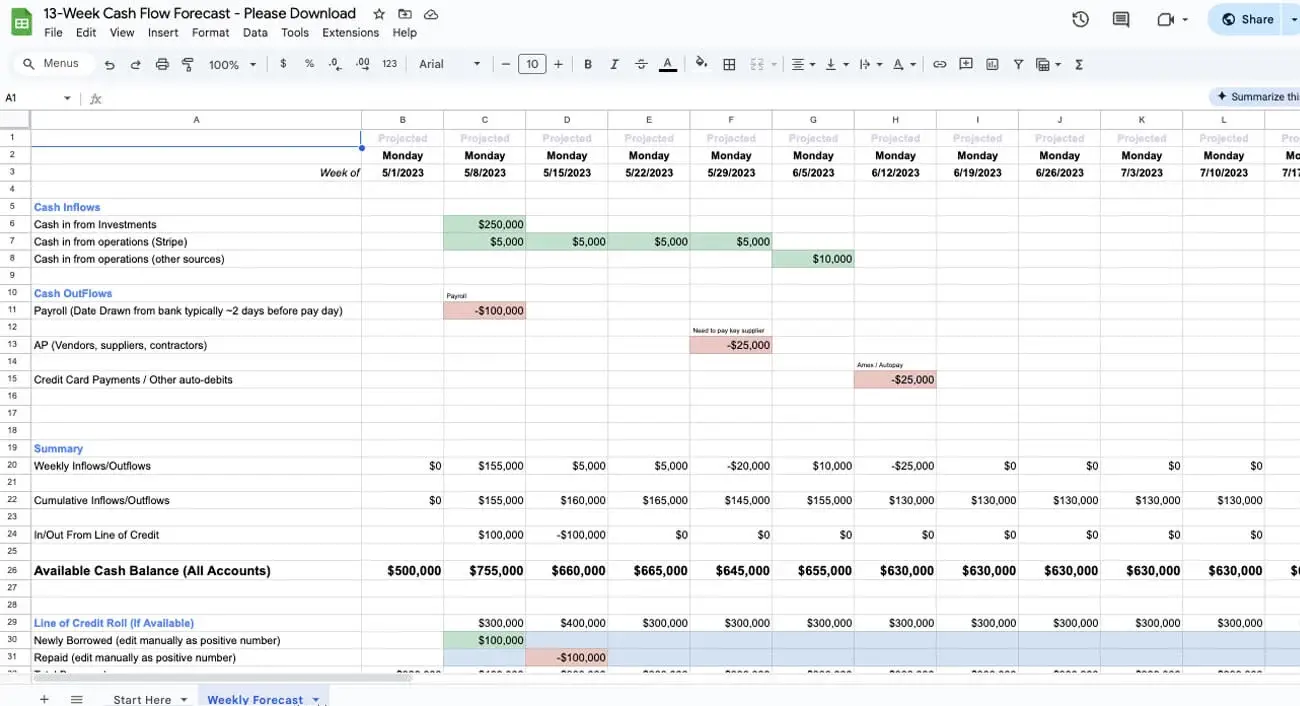
Here at Graphite, we put together a free downloadable Chart of Accounts example that considers all of these best practices. And we split it out by industry for an even quicker time-to-value for you. Pairing this with a cash flow statement template can give your team even more clarity into your financial position and decision-making needs.
If you're ready to revamp your Chart of Accounts and immediately experience more actionable financial analyses, download our free template now. You can also pair it with an income statement template to better track your revenue, expenses, and profitability over time. Contact us today to schedule a free consultation if you need further assistance.
FAQs
What's the difference between QuickBooks Online and Desktop COA templates?
Desktop COA tends to be more flexible and robust, which is ideal for complex startups with more advanced business models. Online COA is more streamlined and user-friendly, better suited for early-stage startups with fewer total accounts.
How do I customize a chart of accounts template for my business?
Start with an existing template and adjust it to meet your needs. Customizing may involve adding accounts, renaming accounts, removing accounts, adjusting account types and details, assigning account numbers, and more.
Can I import these templates into other accounting software?
Yes, most accounting programs offer COA import features, making data transfer easy between different systems. You'll likely have to do formatting work with your template to ensure compatibility.
How often should I update my chart of accounts?
Your COA should be reviewed and updated at least annually. Depending on your startup and its stage, more regular updates may benefit you.
What accounts do I need for tax reporting?
You'll need a combination of financial statements, income and expense records, and other documentation, including employer identification number, sales and expense reports, inventory records and more.


1 min read
Operational Finance: Bridging the Operational CFO and Strategic CFO Gap
Operational finance is finance that focuses primarily on the daily financial activities of a business, requiring a thorough understanding of...